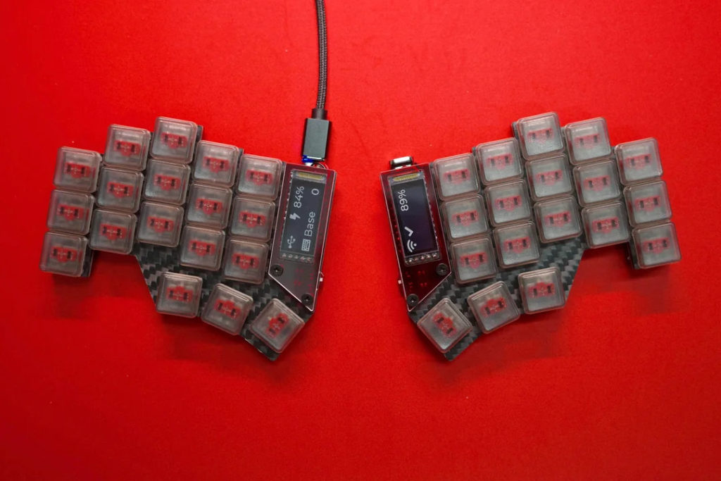
The Temper was designed by Raeed Chowdhury, and is a derivation of the Chocofi. In this post, you’re seeing a build by Reddit user u/Plastic_Depth-1353.
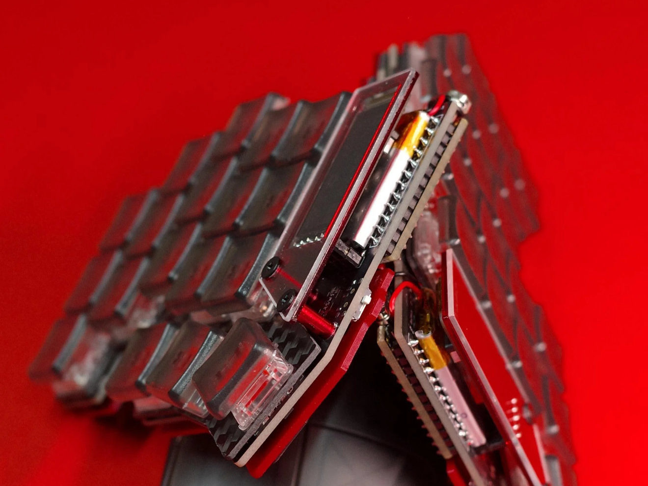
What caught my eye here are the unusual case and very vibrant and crisp photography, and the clean colour scheme of the keyboard itself. It’s a nicely executed build that uses some customised case parts.
This post is part of a series on unique keyboards of which I’ve collected pictures over the years. All of the keyboards in the series were designed by fellow community members. At the time, I rarely collected context or the source, so information may be lacking at times.

Why is it special?
I’ve seen quite a few split keyboards, and it’s quite rare to see a custom bottom plate with a cutout for the controller. Usually, it’d have to sit on top of the keyboard, but with a cutout in the bottom the overall height can be reduced by roughly 4mm. Of course, you’ll expose the controller that way, but with people sometimes also using keyboards without any case, that might not be the worst tradeoff.
GEIST designed a keyboard with a bottom plate cutout, too, called the KLOR. You can see the bottom plate in its build guide. Thank you for the tip, Yingeling!
I suppose the total height could be made even lower had the battery been moved between the controller and the PCB, as you see in most builds. Perhaps this way, a bigger battery could be used, or perhaps the slight increase in additional height would’ve mattered enough to place it as it was. Either way, it’s a novel idea so I figured I’d make a post 😉